Wayfinding Project

Phasing
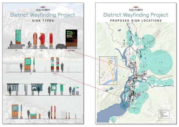
The first phase of the wayfinding system was installed in August 2017, including new Squamish gateway signs (north and south) on Highway 99, Downtown entrance signs (north and south), and the full hierarchy of sign designs throughout the Downtown core. Phase one was designed to test the wayfinding system, and make any adjustments before implementing future phases.
In 2018, new signage (phase two) focused on extending and improving the pilot from phase one. The new signage highlights Downtown Parks, Squamish Estuary, Downtown shopping and dining, and enhances navigation between Downtown and the Squamish Adventure Centre. Design improvements were also made to optimize the legibility of phase one vehicle signs.
Budgeting for further phases of the program is on hold at this time.
Project background info
The District's signage and wayfinding project was introduced with the goal of bringing Squamish’s brand to life by connecting visitors and locals alike to our diverse natural surroundings and our rich cultural heritage. Through an engaging wayfinding system, Squamish will be distinguished as a destination for adventure, recreation, tourism, business and living.
The District of Squamish aims to facilitate economic development through the promotion of tourism and recreation activities in the community. Building on the new brand, the District’s comprehensive wayfinding program seeks to outline relevant locations, destinations, communication and messaging to facilitate visitor movements throughout the community, getting people to the places they want to get as easily as possible.
The District worked with ION Brand Design, along with input from a group of community members representing the Squamish Nation, tourism and business leaders, brand leadership team members, and trail groups to develop a Community Wayfinding Program Design Strategy. The strategy and draft creative concepts were shared at a Council committee meeting on November 10, 2015. Installation of the complete system is planned over five years.
The creative concepts were designed to reflect an essence that evokes the following keywords: active, modern, youthful, bold, innovative, environmental, integrity, and clarity. The concepts feature strong colours and natural materials as well as modern typography and organic elements that, when combined, present a complete system distinctive to Squamish. Materials were chosen to stand up to Squamish weather and ease of maintenance was a key factor in the design.
Public input into the locations of the signs was gathered between April 22 and May 6, 2016, when the signs were showcased at the Squamish Adventure Centre and Brennan Park Recreation Centre. Input was also invited online.
Squamish wayfinding system facts
1. The wayfinding system was designed to bring the Squamish ‘Hardwired for Adventure’ brand to life and to set Squamish apart as a destination for adventure, recreation, tourism, and business.
2. The materials chosen are durable and authentic and will stand up to our typical westcoast weather. The corten steel will weather to a deep “rust” colour over time.
3. The signs pay tribute to the Squamish wind. The shapes and contours of the signs reflect the ideas of wind movement, like a sail, and incorporate elements that capture Squamish’s adventurous spirit and outdoor rituals, like rock climbing.
4. The design essence encompasses the Squamish culture and lifestyle. We are active, modern, youthful, innovative and bold.
5. Teal was introduced in the gateway signs as a tribute to the glacial blue of Howe Sound. The system’s colour palette embodies the colours of an expanded Squamish brand palette.
6. The signs incorporate Eye of the Creator carvings to illustrate our past and future, and to acknowledge our proud First Nations heritage.

